Please edit/review my invite (spanish version included)!

-
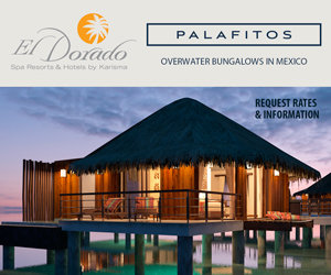
Best Destination Wedding Sponsors


-
-
Posts
-
 Hi everyone! I have been doing lots of research on various wedding venues all around Mexico, my fiance wants a destination wedding and I am happy to have a wedding wherever so long as the vibe is right and guests are happy! I have been seriously looking at Cabo Azul and was trying to find potential costs for them, but only found a page about their wedding costs from 2010. Does anyone have any updated information on costs / reviews they would like to share of this venue? Or advice in general, anything helps. Thanks so much, happy wedding planning to all!
 -
 Have you ever considered having a wedding inside a bubble? With the current global situation, many couples are looking for unique and creative ways to celebrate their special day while keeping their guests safe. A wedding inside a bubble could provide a whimsical and intimate setting for your ceremony and reception. Imagine saying your vows surrounded by a beautiful bubble filled with twinkling lights and flowers, creating a magical atmosphere for you and your loved ones to enjoy.
 -
Adult only resort or not? Let's discuss the pros and cons of choosing an adult-only resort for your honeymoon. While some couples may appreciate the peace and quiet that comes with an adults-only environment, others may prefer a more family-friendly atmosphere. What are your thoughts on this? Have you had any experiences at adult-only resorts that you'd like to share? Let's hear your opinions and recommendations!
-
When it comes to planning a wedding, one of the most exciting parts is choosing the perfect wedding favours for your guests. These small tokens of appreciation are a great way to thank your loved ones for being a part of your special day and to make them feel appreciated.
-

By stkittsdestinationwedding · Posted
Does anyone know of a rabbi in the Caribbean or nearby that would travel to St. Kitts to officiate a June wedding this year?
-
-
Topics
-


Recommended Posts